I led the design for Toast XtraChef's data insights experience. XtraChef is an add-on service for existing toast customers, its mission is to help restaurants become more profitable using insights generated from their invoices. I enabled restaurant owners to assess “How is my business doing?” by displaying relevant data for them to make better financial decisions.
Impact
Engagement +18%
NPS +4
Designs
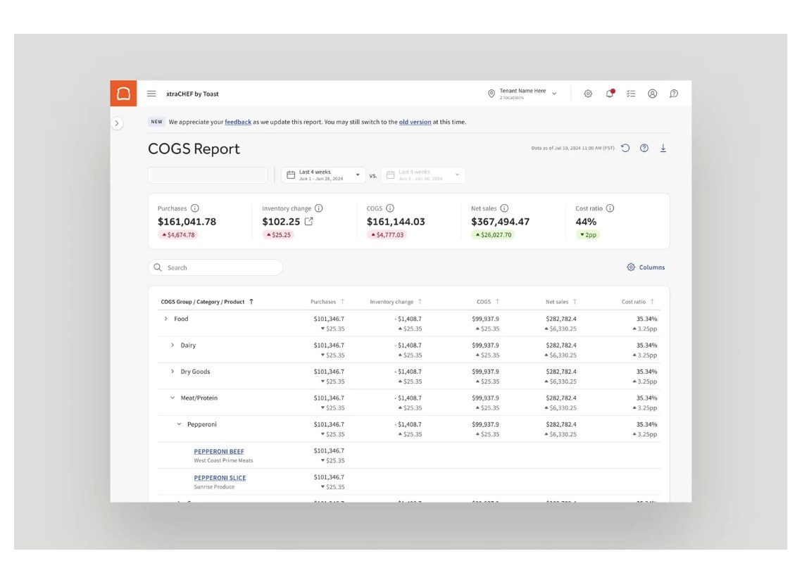
Released COGS Data Insights Designs
- XtraCHEF Dashboard > COGS Report
- COGS Report, Comparison Date Range
- COGS Data Breakdown Table
- Customizable columns
Background
Why the old designs didn't work
I looked into the pages traffic and conducted an audit of the existing data insights/reporting experience:
- Data points were named differently and calculated differently on each related page, making them very difficult for restaurant owners to understand.
- Graphs lacked numerical context and were hard to decipher.
- COGS was presented in isolation, without sales or labor cost comparisons.
The above problems led to low engagement, reduced perceived value, and limited business impact.
COGS: Cost of goods sold. It is the cost of all the ingredients used to make the food and drinks a restaurant sells.
Problem
Customers struggled to see meaningful value and data insights on Xtrachef.
They were churning from Toast Xtrachef subscription significantly and giving low NPS.
Solution
Solution: COGS Reports
We first focused is COGS.
I led a few interview sessions with sales, marketing, and my PM, further confirming that COGS data exist uniquely on XtraChef and are the main reason customers subscribed for the product.
Tracking COGS helps restaurant owners control costs, set prices, and maintain profits.
Invoice data: ingredients cost, inventory, menu price, and margin.
I held research sessions on how restaurant owners and managers interpret cost data, react to comparison patterns, and make decisions when metrics fluctuate.
“I want to see how this compares to last month and how it performs seasonally without digging through multiple reports.”
Seasonal Cost Comparison
Instead of designing data visualizations, for the MVP we focused on presenting accurate data with consistent names, clear numbers and comparisons.
Testing showed that the data visualization I iterated on did not speak to the restaurant.
- Numbers First, Graphs Later: I emphasized the metrics on top so that they are front and center.
- Comparative Trends: I highlighted the importance of data range comparison to help users track fluctuations and monitor seasonal change.
Decisions
Drilling Down: From COGS Summary to Itemized Numbers
COGS Metrics Table
Decision #1: Descriptive data to Diagnostic investigation
I framed and designed the data storytelling methods for customers to investigate what item/food ingredients are contributing to the COGS fluctuation, since the main metrics fluctuations come from itemized data fluctuation.
Decision #2: Customizable table columns for unique needs
Based the ten research sessions’ insights, I added customizable table columns for each restaurant’s unique needs so that they can choose which data they want to see on the table.
Future
Future
This project I led set the foundation for future Xtrachef data insights experience, helping the team move to Descriptive and Diagnostic stage. In the future, how far do we want to go when presenting metrics and insights?
- COGS to ingredient price tracking
- Integrate inventory into COGS calculation
- Use data and right visualization to tell a story for restaurants.
Next project